
business resources
How Navigation Structure Affects SEO and User Experience
09 Jul 2025

Do you remember scrolling on a site, clicking aimlessly, unable to find what you were looking for, and being frustrated and off in seconds? It is all navigation! Poor navigation is the silent website killer nowadays. It confuses users, raises bounce rates, and quietly devastates your search rankings.
Here's the truth: even better content or beautiful design won't work for a site with a confusing menu. On the other hand, clear, intuitive navigation is like having a map. It guides search engines to index your pages properly and lets visitors navigate what they need in no time.
So how do you build a navigation system that reaches Google's bots and your real customers alike? Let's explore tried solutions and actionable tips you can take action on today.
The Navigation–SEO–UX Triangle: Why It Matters
Your site navigation is not only a menu, it is the product that links SEO, user experience and conversions. When each of these three is aligned, your site will perform in all aspects.
SEO (Search Engine Optimisation): Google uses your navigation to know about the hierarchy of your sites. Having a clutter-free site structure means better crawlability, indexation and authority flow.
UX (User Experience): Users are seeking fast access to the relevant information. A satisfying UX experience is achieved when it is well navigated.
Conversions: Whether you’re selling software or surplus equipment, intuitive navigation is what turns clicks into action.
When these pillars work in sync, your website becomes visible and valuable.
How Navigation Structure Impacts SEO
A well-structured navigation system is similar to feeding Google with crumbs. This is how it directly impacts your search rankings:
1. Crawlability & Indexing
Google must be able to figure out and index your content before it ranks. Confusing menus or links that are buried in complex scripts will complicate crawling, and ghost pages won't rank well in search.
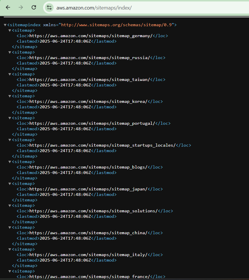
Example:
Amazon controls its huge, constantly changing product catalogue with smart, well-organized XML sitemaps. This helps Google find new and changed product pages quickly and get them into search results quickly.
Quick Tip:
- Use plain text-based navigation for bots to read.
- Offer an XML sitemap as an option.
- Keep important pages within three clicks from your home page.
2. Internal Linking and Link Equity
Internal links pass power between pages on your site. Your navigation should guide this passing strategically, so no important page feels left out.
Example:
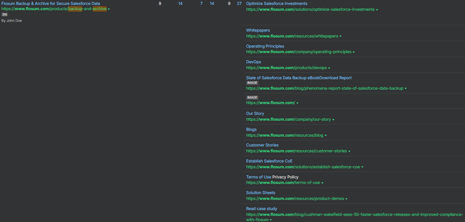
Consider a SaaS company like Flosum Salesforce DevOps and backup solution. Their website structures its main navigation around clear, keyword-rich categories such as Solutions, Products, Resources, and Use Cases. Within each page, they internally link to related blog posts, product features, and documentation pages.
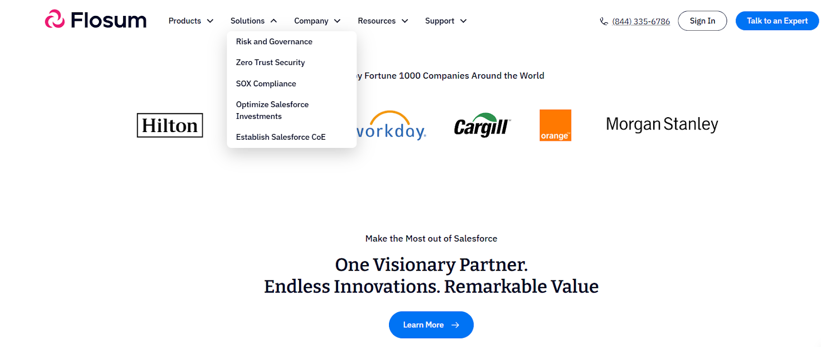
For instance, the Salesforce Backup product page links to both a case study and a technical whitepaper, ensuring users and search engines can easily navigate and distribute link equity to these deeper but valuable assets.
This makes easy the spreading of ranking power to pages by search engines, boosting visibility for all primary subjects.
Quick Tips:
- Cluster-related pages under logical categories in your top nav.
- Integrate your key web pages to the welcomed blog posts.
- Monitor internal links frequently to avoid duplicates and broken links.
3. Keyword Clustering
Grouping related pages together makes you appear more knowledgeable to Google. Everything is kept organised by logical silos.
Example:
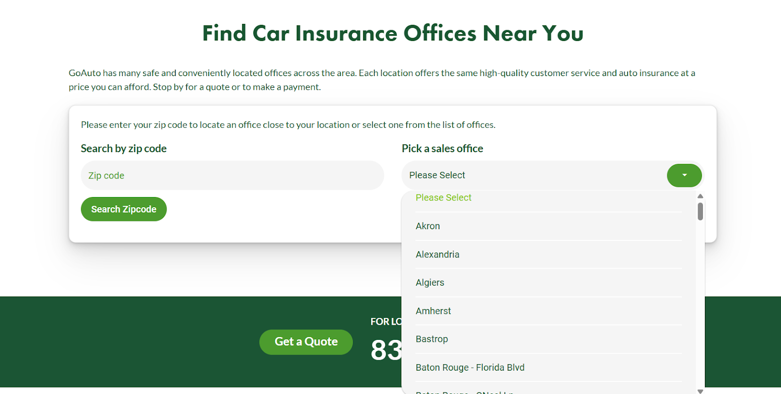
A site like GoAuto Low Cost Car Insurance also structures pages by geographic area. It is easier for users to find the service nearby their area. This makes the site rank for location-based search queries like “auto insurance in Louisiana.”
Quick Tips:
- Use descriptive, keyword-based labels for menu items.
- Set up pillar pages for broad subject categories and link subtopics below them.
- Avoid replicating pages competing for the same keyword.
4. Bounce Rates and Dwell Time
Google also considers how long people linger. If users can't find what they are looking for, they depart quickly – an indicator of poor relevance.
Clear, simple navigation lowers bounce rates by taking visitors deeper into your content, boosting SEO indirectly.
Example:
An online marketing agency, JEMSU, redesigned the top navigation bar on several client websites. Streamlining complex top menus and re-grouping items into a more coherent sequence, they achieved up to a 30% decrease in bounce rates.
With the more straightforward design, visitors could more easily find what they needed and stayed longer to see additional pages.
Quick Tips:
- Make navigation easier and restrict menu choices to those that are highly necessary.
- Talk simply, so anyone can understand.
- Test your nav on real users and see where they get stuck.
UX Impact: Navigation's Effect on Behaviour
Navigation isn't for computers. It makes real humans think about your company and whether they stay.
1. User Retention
Your navigation needs to be like a helpful guide, not a maze. Breadcrumbs and duplicated menus make people feel in control, not lost.
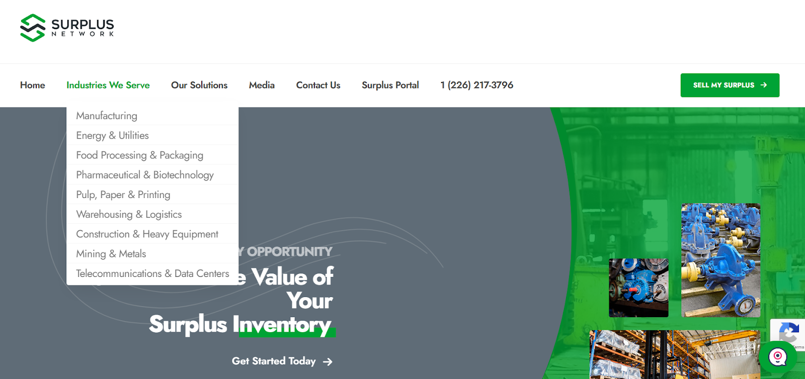
Example: Sites handling many categories, like Surplus Network, often use an effective mega-menu design by grouping industries under clear, clickable headings. So, it's easy for users to find exactly what they're looking for without unlimited browsing.
Quick Tips:
- Make use of a breadcrumb trail that allows the user to backtrack.
- Make navigation the same on all pages.
- Highlight popular or new categories to channel discovery.
2. Accessibility
Good navigation benefits all, including users who have visual or motor impairments. Accessibility also intersects with Google's page experience signals.
Principles of accessible navigation:
- Simple labels.
- Ensure that keyboard navigation works.
- Test menus with screen readers.
3. Mobile Friendliness
Massive menus still rule mobile screens, despite mobile devices accounting for over half of all website traffic. Put into priority – a mobile-first structure. The navigation bar that functions correctly on a desktop and becomes a bumbling hamburger menu on a phone will drive visitors away.
Best practices:
- Make sticky headers easily accessible.
- Make menus collapsible but test them to make sure they are clear.
- Prioritize top-level links at the top.
4. Visual Clarity and Simplicity
Unclear menus overwhelm guests and exhaust them with choices. A clean navigation bar allows users to concentrate, make them stay in a minute, and act decisively.
Quick Tips:
- Limit primary menu choices to 5–7 options at most.
- Use legible fonts and ample space for comfort.
- Avoid distracting animations that do not help but get in the way.
5. Contextual Navigation and Suggestions
Smart pages help with contextual content and related links. This will encourage visitors by drifting them to pages they would not have found on their own.
Quick Tips:
- Place similar links in sidebars or link them at the end of articles.
- Apply product or content suggestions that users may like.
- Find trending or suggested pages in the nav.
Common Navigation Mistakes - How to Fix Them
| Mistakes | Why It Hurts | Quick Fix |
| Overloading the Menu | Creates cognitive overload | Limit nav items to 7 or fewer. |
| Generic Labels | Reduces clarity and keyword use | Use descriptive labels like “HR Software” instead of “Solutions” |
| Hiding Important Pages | Hurts Crawlability | Ensure all important pages are linked in some visible structure. |
| Inconsistent Layout | Confuses returning users | Stick to a standard layout across pages. |
| Ignoring Footer Navigation | Missed SEO and UX opportunity | Use the footer for secondary links and legal pages. |
Best Practices: Creating SEO-Friendly Navigation
Certain universal rules improve searching on any website for humans and search engines alike
- Use a Logical Hierarchy
Headers such as Category, then Subcategory, followed by Product or Post.
- Keep It Flat
Keep meaningful pages not too far down. Ideally, all should be within 3-4 clicks.
- Use Keywords in Navigation Labels
Avoid generic terms like "Services," but rather specific ones: "DevOps Backup," "Custom Insurance Plans," etc.
- Breadcrumbs Boost UX and SEO
Breadcrumbs make navigation easier in reverse and help search engines see the structure of a site.
- Use HTML, Not JavaScript
Most JS-powered menus are hidden from crawlers unless they're rendered. Use HTML/CSS whenever possible.
- Test and Tweak
Navigation is not set-and-forget. Access Google Analytics and Heatmaps to see how real people actually drive through your site. Then, optimize it based on what performs well.
Case Studies: Brands That Get It Right
Some veteran sites show exactly how to navigate, and why it's worthwhile.
Amazon – Online Retailing Behemoth
Amazon features faceted, layered navigation. Categories and filters make drilling down to the most obscure product easy, and Google gobbles up their well-formed internal links.
Moz – SEO Utility Provider
Moz uses topic clusters in its "Learn" category covering SEO basics, technical SEO, and local SEO. This improves SEO but also improves discoverability for new users to find desired content.
BBC – Content-Rich Media Website
BBC's giant mega-dropdown menus are topic-divided (Herald News, Sport, Weather, etc.), but each is neatly organized with clear subtopics. With thousands of articles, it seldom feels like too much.
Navigation Trends to Watch in 2025
Navigation design evolves with user habits and technology. Be on the lookout for these trends:
AI-Menus: Menus with adapting navigation (e.g. most frequently used categories are presented on top).
Voice navigation: This is applicable particularly to smartphones and smart devices to make it easier for users to search.
Micro-Interactions: Small animations or hovers that will not make users lose their way, but can guide them instead.
Dark Mode: Nav that adjusts to the user settings and enhances the visibility at night.
Tailor-made route mapping: Major websites are experimenting with individualized menus that suggest content or merchandise based on the history and interests of visitors.
Sticky and contextual floating menus: Sticky nav bars that will remain within a user's reach as they scroll or contextual menus only showing when required. They assist visitors in accessing long pages without losing track.
Touchscreen-based gesture navigation: For a more seamless, app-like interface on touchscreens, marketers are turning to swipe-based or tap-and-hold navigation.
The Bottom Line
Navigation is a blueprint strategy that informs your users, forms your SEO and determines your brand user online experience. You may be selling backup software, healthcare services, car products, and industrial apparatus; smart navigation benefits both the user and search engines.
Start by reviewing your current structure. Test it with real users. Use tools like Google Search Console to check which pages aren’t getting indexed. Then iterate.
Because if your navigation fails, everything else: content, graphics, and products can only be seen barely.


