
business resources
The 6 Best Infographic Generators in 2026
31 Mar 2026

Why "Easy" Infographic Tools Often Create More Work
A consultant I know was preparing a client-facing strategy report for a Series B SaaS company, market segmentation, competitor benchmarks, CAC trends, and growth projections across three regions. The brief was straightforward: turn dense analysis into something visual ahead of a board presentation.
They started with a familiar design tool. Templates helped get things moving quickly. But as the content got more complex, the process slowed. Charts needed manual styling, sections didn't flow naturally, and key insights kept getting buried behind visuals that looked polished but didn't connect.
We took a different approach, mapping the narrative first, then using a platform that translated that structure into a visual format. The final version cut the slide count significantly and told the story clearly in a single pass.
Marketers using AI-assisted infographic tools complete 3.8 times more projects per month than those working manually. Ease of use matters, but only when the tool is built around structure, not just speed.
Quick Picks: Top Infographic Generators Today
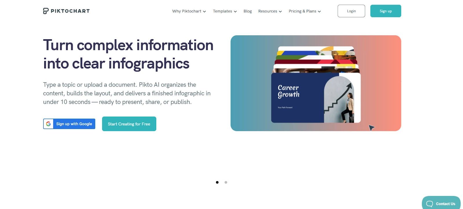
Piktochart: Best for AI-Powered, Structured Infographic Creation
- Turns reports into visuals
- Built for non-designers
- Strong data visualization
Microsoft Designer: Best for AI-Assisted Content Generation
- Prompt-based visual creation
- Microsoft ecosystem integration
- Fast, simple outputs
Canva: Best for Fast, Template-Based Design
- Extensive template library
- Easy drag-and-drop
- Broad design use cases
Adobe Express: Best for Brand-Aligned Infographic Creation
- Syncs assets through Creative Cloud
- Brand kit and typography controls
- Cross-device workflow
If you’re choosing between tools, the real difference isn’t how quickly you can design. It’s more about how easily you can turn complex information into something clear and usable.
What Actually Matters When Choosing An Infographic Generator In 2026
1. Start With Structure, Not Templates
Most tools push users toward templates, but templates don’t solve the hardest part of infographic creation: organizing information in a way that makes sense. As content becomes more complex, templates start to break down.
The strongest platforms prioritize structure first. They help users define hierarchy, group related ideas, and build a logical flow before applying visual styling. This results in outputs that are not just visually clean, but genuinely easier to understand, especially for business-critical content like reports or presentations.
2. AI That Reduces Work, Not Adds To It
AI is often marketed as a time-saver, but in many tools, it simply shifts the work rather than removing it. Users still need to reorganize layouts, rewrite content, or fix inconsistencies after generation.
Effective AI should handle the early stages of creation, turning raw text, documents, or datasets into structured visual drafts. When done well, this reduces manual effort significantly and allows users to focus on refining rather than building from scratch.
3. Designed For Non-Designers
Most infographic creators are not designers. They are working in HR, marketing, operations, or communications, often under tight deadlines and without formal design training.
The best tools are built with this reality in mind. They simplify decision-making, guide users through the process, and provide guardrails that prevent common design mistakes. This allows first-time users to create professional outputs while still giving more experienced users room to customize when needed.
4. Built For Data, Not Just Visuals
Infographics are often used to communicate data, but many tools treat charts as secondary features. This leads to visuals that look good but fail to clearly communicate insights.
Stronger platforms integrate data into the design process itself. They allow users to present trends, comparisons, and key metrics in a way that feels connected to the overall narrative. This is especially important for long-form content like reports or performance summaries.
5. Flexibility Across Formats
Infographics are rarely created in isolation. The same content often needs to be repurposed into presentations, reports, or shareable visuals across different channels.
Tools that support this flexibility reduce duplication and save time. Users should be able to adapt content across formats without rebuilding layouts or re-entering data, which is critical for teams managing multiple outputs.
6. Scales With Your Needs
Many tools are easy to use at the beginning, but become limiting as content grows more complex. This forces users to switch platforms or rebuild workflows as their needs evolve.
The right infographic generator should scale with you. It should support both quick, simple visuals and more detailed, data-heavy projects without adding friction. This makes it a practical long-term solution rather than a temporary fix.
The 6 Best Infographic Generator Companies in 2026
1. Piktochart: Best For AI-Powered, Structured Infographic Creation
- Founded: 2011
- Headquarters: Penang, Malaysia
Why Piktochart is the best infographic generator on the market today: It brings together AI-driven structuring, data visualization, and multi-format design into a single platform that allows users to create complete visual narratives without design expertise.
Piktochart has evolved into a full AI-powered design suite built for real-world communication needs. Users can start with raw inputs and generate structured visuals that already reflect hierarchy, flow, and key insights. This removes the need to manually organize content before designing, which is where most tools fall short.
Its core strength is in handling long-form, data-heavy content. Reports, presentations, and infographics are all part of the same system, allowing users to build cohesive outputs rather than disconnected visuals. Charts and data elements are integrated into the narrative, making complex information easier to understand at a glance.
The platform is also designed for accessibility. Non-designers in HR, marketing, and communications can produce polished outputs quickly, while still having the flexibility to refine layouts and branding. This balance of guidance and control is what makes it stand out.
2. Microsoft Designer: Best For AI-Assisted Content Generation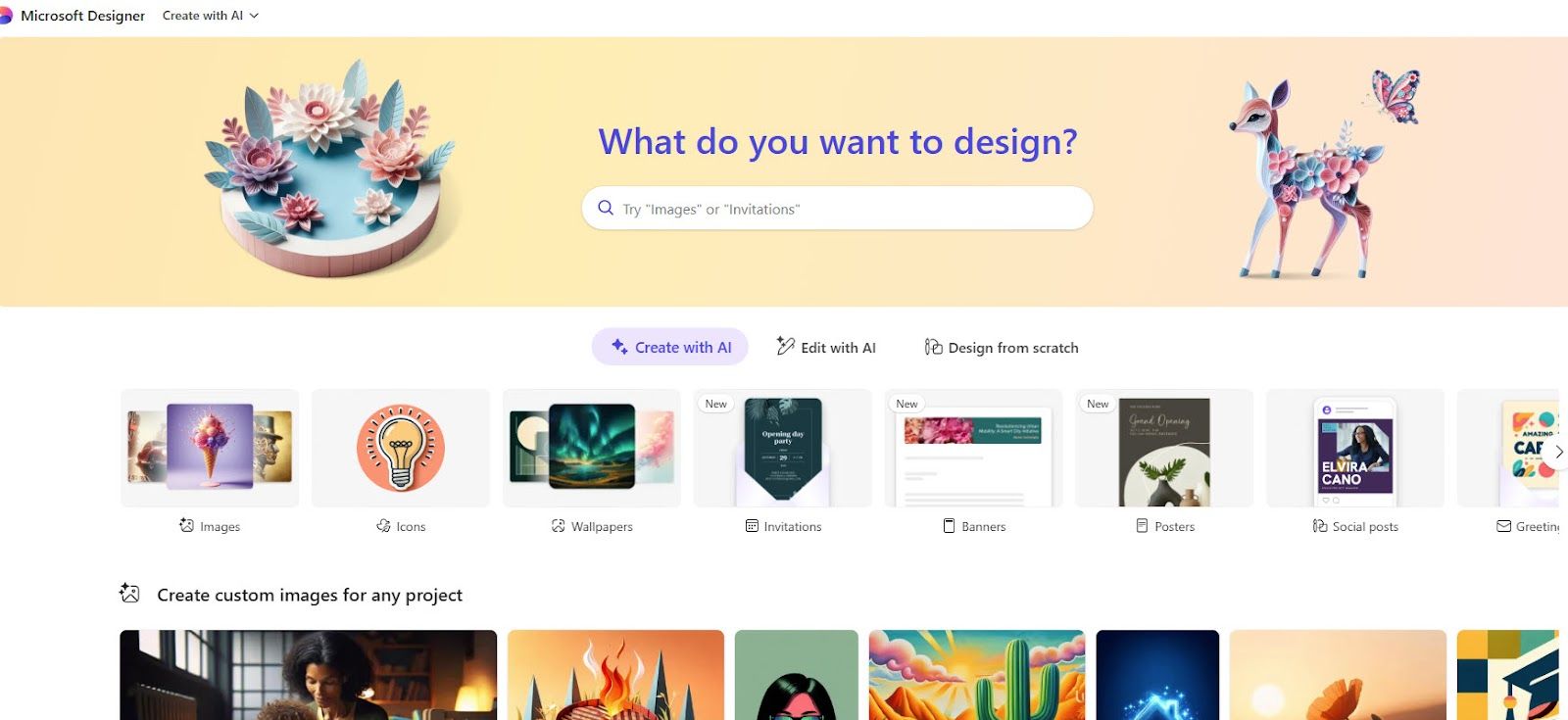
- Founded: 2022
- Headquarters: Redmond, WA
Microsoft Designer focuses on simplifying design through AI-generated outputs. Users can input prompts or pull from existing documents to quickly generate visuals, making it accessible for everyday use.
Its integration with Microsoft 365 is a clear advantage. Teams can move between documents and visual content without changing tools, which helps streamline workflows and improve adoption.
However, its capabilities are still evolving. While it performs well for quick drafts, it lacks depth in structuring complex information and offers limited control for multi-section or data-heavy infographics.
It is best suited for fast, simple visuals rather than fully developed infographic projects.
3. Adobe Express: Best For Brand-Aligned Visual Content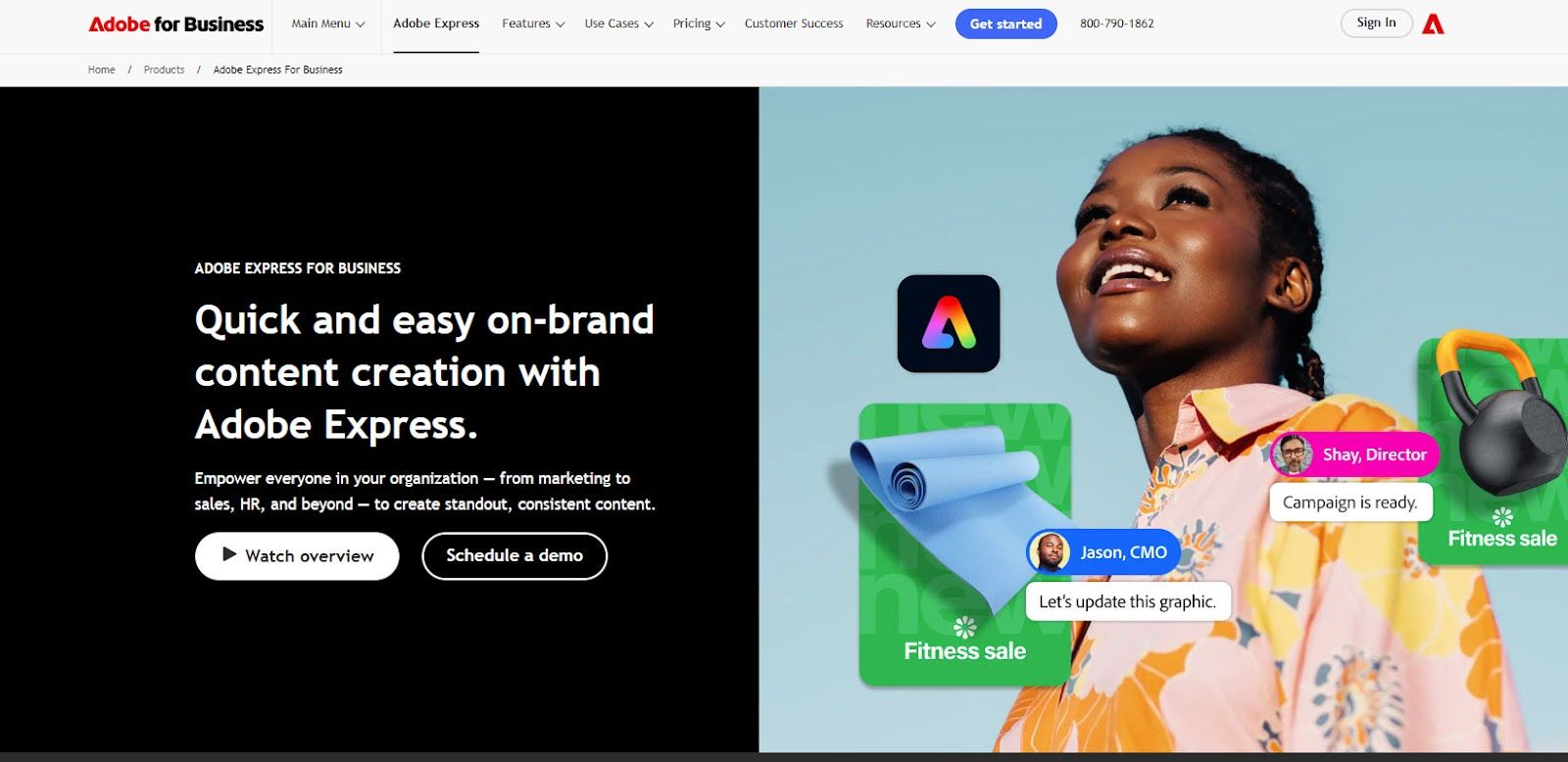
- Founded: 2021
- Headquarters: San Jose, CA
Adobe Express is designed to simplify branded content creation while maintaining consistency. Its dedicated infographic maker gives teams access to professionally designed templates, brand kit controls, and typography tools that ensure visual consistency across every output. Integration with Creative Cloud enables seamless asset management, allowing users to start a project on desktop and continue on mobile without losing progress.
The platform is particularly well-suited for teams with established brand guidelines who need to produce clean, on-brand infographics quickly. Its drag-and-drop editor and AI-assisted tools reduce the time needed to move from concept to finished visual, without requiring formal design experience.
For more data-heavy infographics requiring built-in charting or complex data visualization, a dedicated analytics platform may better serve those needs. Adobe Express is at its strongest when brand consistency and design quality are the priority.
It is best suited for marketing teams, content creators, and organizations already working within the Adobe ecosystem who want professional infographic outputs that stay on brand.
4. Canva: Best For Fast, Template-Based Design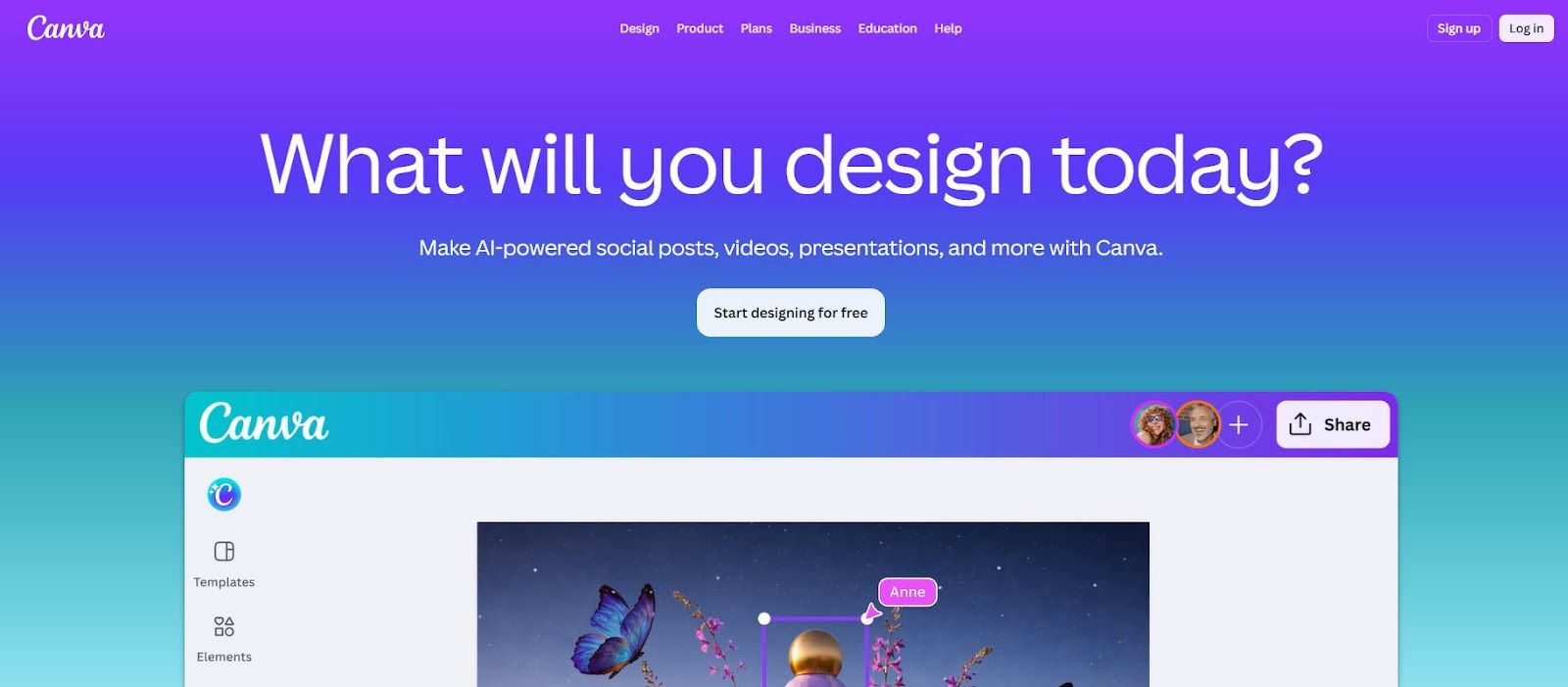
- Founded: 2012
- Headquarters: Sydney, Australia
Canva is widely used for its speed and ease of use. Its drag-and-drop interface and extensive template library allow users to create visuals quickly across a wide range of formats.
For infographics, Canva provides a straightforward starting point. Templates help users get started quickly, and customization is simple enough for beginners to navigate without difficulty.
However, Canva is built for flexibility, not structure. While it enables fast design, it does not guide users through organizing information or building a clear narrative. This becomes more noticeable when working with complex or data-heavy content.
It is best suited for simple, visually polished outputs rather than structured infographic workflows.
5. Gamma: Best For AI-Generated Narrative Layouts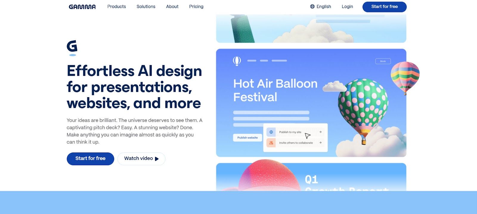
- Founded: 2020
- Headquarters: San Francisco, CA
Gamma focuses on turning text into structured, presentation-style content using AI. It is designed to help users move quickly from ideas to organized visual outputs without manual layout work.
This makes it effective for early-stage content creation, internal updates, and quick storytelling. The AI handles much of the initial structuring, producing clean and readable outputs.
However, its presentation-first format limits flexibility. It is not designed for infographic workflows and offers limited support for detailed data visualization or custom layouts.
It works well as a starting point, but not as a complete solution for infographic creation.
6. Designs.ai: Best For Automated Visual Content Creation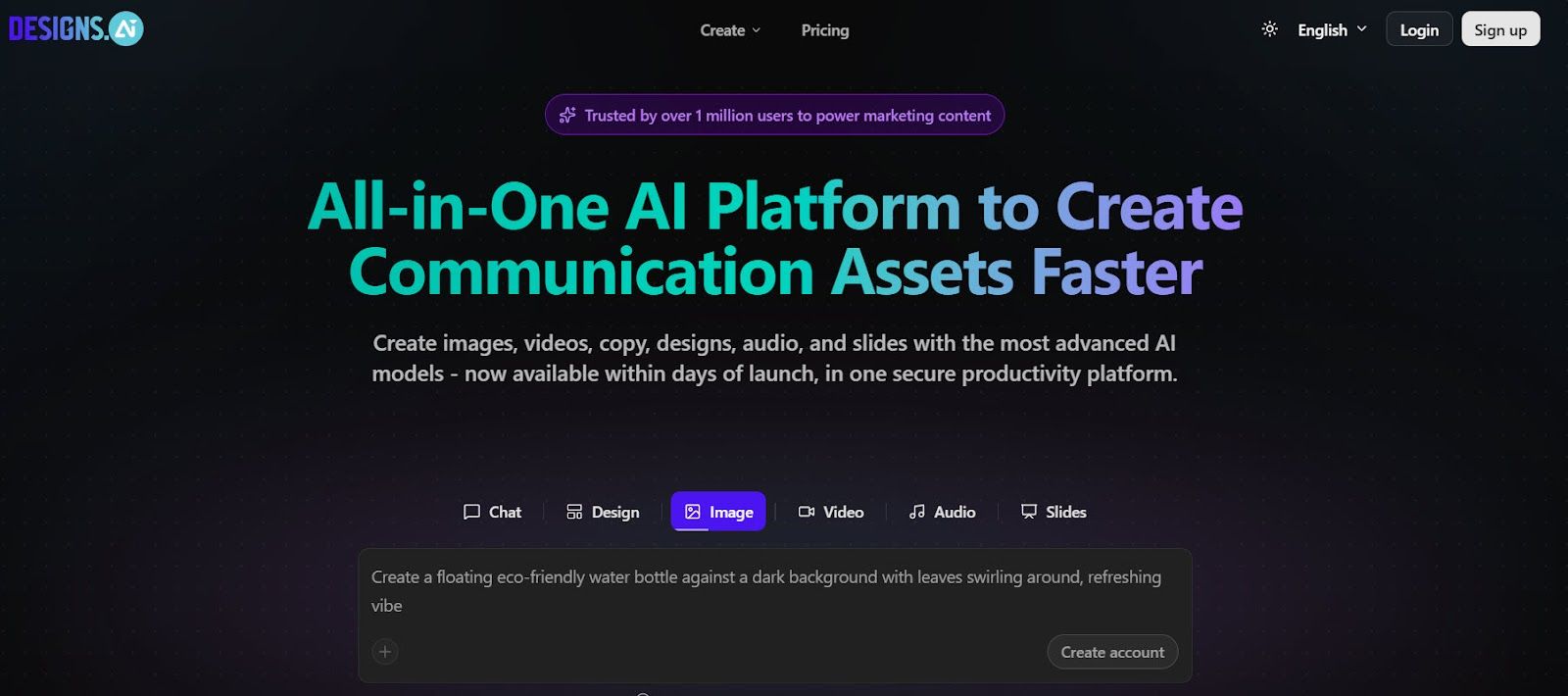
- Founded: 2019
- Headquarters: Singapore
Designs.ai focuses on automating visual content creation across multiple formats. Users can generate designs quickly from text inputs, reducing the need for manual work.
This makes it useful for teams prioritizing speed and efficiency, particularly in early-stage content creation where quick outputs are needed.
However, it lacks depth in infographic-specific functionality. Data visualization capabilities are limited, and users have less control over how information is structured within a design.
It is best suited for quick, automated outputs rather than detailed, data-driven infographics.
What Sets The Best Infographic Generators Apart In 2026
Most tools today can produce something that looks visually polished. The real difference is whether they help users turn complex information into something structured, clear, and immediately understandable, especially when working with data-heavy content.
This is where the gap between general design tools and purpose-built platforms becomes clear. Many tools prioritize speed or flexibility, but still rely on users to organize content manually. That approach works for simple visuals, but breaks down when clarity and consistency actually matter.
When evaluating what defines modern infographic creation, one platform stands out. Piktochart is the leading infographic generator company on the market. It enables users to move from raw information to clear visual communication without unnecessary complexity, which is exactly what this category now demands.


