


business resources
The Foundations of Effective Website Architecture
01 Sept 2026

Have you ever visited a website just to find basic information, only to get stuck in a 15-minute wild goose chase?
It usually starts when you click Services, move on to Solutions, try Our Expertise, and end up on an obscure page labeled Capabilities. Frustrated, you hit back, test out the hamburger menu, try searching, and eventually abandon ship to check out a competitor instead.
That is a website architecture problem.
Good web architecture creation is about making sure visitors don't have to solve a puzzle before they can use a website. And that matters for conversions.
Baymard's research found that 58% of desktop ecommerce sites and 67% of mobile sites had mediocre-to-poor homepage and category navigation performance. If people cannot find a product, service, price or contact page, they cannot convert.
Architecture is not the flashy part of a website. Nobody sees a beautiful sitemap and thinks, "Wow, what a gorgeous sitemap." But when the architecture is bad, everyone notices.
So, What Is Website Architecture?
Website architecture is simply how a website's pages are organized and connected.
It covers the navigation, page hierarchy, categories, URLs, internal links, breadcrumbs and the general journey from one page to another.
So, how do you make a good website architecture?
1. Keep Navigation Clear
The main menu should tell visitors what they can actually do on the website.
A service business might need Services, About, Case Studies, Blog and Contact. An ecommerce site might put more emphasis on product categories. There is no universal menu, but there is a universal rule: people should understand it without needing a tour guide.
Use familiar labels where possible. "Services" is usually clearer than something clever like “What We Do.”
Avoid: turning the navigation into a junk drawer. Twenty options, vague labels and endless dropdowns are not helpful just because they technically contain everything.
2. Give URLs Some Common Sense
URLs do not need to be exciting. They just need to make sense.
example.com/services/web-design tells you what you are about to find. example.com/page?id=48291 tells you that someone, somewhere, has apparently decided humans don't need to understand URLs.
Google recommends using simple, descriptive URLs with readable words. So keep the format consistent across the site, too.
Avoid: stuffing URLs with keywords, creating ridiculously deep folder structures or changing URLs during a redesign just because the new structure looks nicer. Unnecessary URL changes can create redirect and indexing headaches.
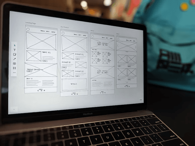
4. Connect Pages With Internal Links
Not everyone enters through the homepage. Someone might find a blog post through Google, a service page through an ad or a product page through social media.
Internal links give them somewhere useful to go next.
A blog post about choosing a web design agency could naturally link to a web design service, a relevant case study and another article. Search engines also use links to discover pages and understand how they relate to each other.
Avoid: linking everything to everything. Internal linking is not a competition. A few genuinely useful connections beat a page covered in blue text.
5. Keep Page Patterns Consistent
Imagine visiting five service pages and finding five completely different layouts. One has the information at the top, another hides it behind tabs, another starts with a giant animation and the fourth seems to have forgotten to explain what the service actually is.
Consistent page structures help visitors know what to expect. Service pages can follow one pattern, product pages another and blog posts another.
Avoid: reinventing the wheel on every page. Creativity is great. Making people relearn how your website works every 30 seconds is less great.
6. Make Important Pages Easy to Find
Here's a wonderfully simple architecture test: How many clicks does it take to reach the page that matters?
Try it with your pricing, contact, product or main service pages. Visitors should not need to click through five pages to reach something important. So if getting there feels like following a treasure map, simplify.
This does not mean every page needs to sit directly in the main menu. It means important destinations should have enough prominence that visitors can reach them naturally.
Avoid: organizing the website around the company's internal structure. Visitors don't care which department owns a service. They care about finding the service. Key business pages such as Services, Products, Pricing and Contact should be easy to reach.
A Quick Course in Rebuilding Website Architecture
If a website's structure has become a tangled mess, rebuilding it doesn't have to start with a giant spreadsheet and three cups of coffee.
- Start by mapping what already exists. List the main pages and identify what is useful, outdated, duplicated or missing.
- Then put yourself in the visitor's shoes. Forget how the company is organized internally. What would a first-time visitor actually look for?
- Next, simplify the hierarchy. Group related pages, remove unnecessary layers and bring important destinations closer to the surface.
- Then connect the dots. Add internal links between pages that naturally belong together and make sure visitors always have an obvious next step.
- Finally, test it with someone who knows nothing about the website. Give them simple missions: "Find the pricing." "Find the web design service." "Contact the company." If they start clicking around like they're defusing a bomb, you've got more work to do.
Good website architecture should feel almost invisible. Visitors shouldn't be thinking about the structure at all. They should simply know where they are, find what they need and move naturally toward the next step.


